Tuesday, January 29, 2013

HELP NEEDED - 2003-04 Pacific McDonalds SET BUILD

I'm not one to set build. In fact I only have two complete base sets; both are of SP Authentic. However, collecting is also about experimenting. So I'm going to make it a goal to build a set.

I didn't just make this decision while shuffling through cards bored. I saw a complete built base set on the shelf of my LCS listed at 30 bucks and thought: "Wow that would be a neat set to look through in a binder" and so I decided to go for it! But what fun is there in buying? If I can build this realistically attainable set on my own through trades etc. why not?

The set you ask? Well for my friends in the US of A, it's called 2003-04 Pacific Atomic; otherwise known as the once annually released set held by McDonalds across Canada. McDonalds released cards through Upper Deck starting in the early 90's and then switched to Pacific in the early 2000's only to switch back to UD for the 05-06 season. Unfortunately, McDonalds stopped this promotion and it's last release was in 2009-10.

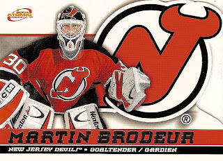
The 2003-04 release was my favourite by far and nostalgia pushed me to build the set. Here's a look at what the base cards look like:


As you can see the right side of each card has a die-cut team logo popping out. Pretty cool eh? The reverse side has everything written en anglais et français. Unfortunately due to the fact I believe I was in grade three at the time these came out, some cards I have look like this:


Ain't that a lovely crease for ya! Poor Giggy never saw it coming. The base set clocks in at 55 cards, which is smaller than I think every product that comes out these days. I have a head start owning 14 of the 55 base already. The set I'm building excludes the six rookie AUTO's (included in the base set technically). Those AUTO's book anywhere from $200-400 in top shape. It also excludes the "McDonalds Pacific Patches," (Silver and Gold variations) again those ring from the lowest at $80 and highest $500. Hard to believe that a Mario Lemieux McDonald's patch card would go for 5 bills but that's what the book says.

The most exciting part will be collecting all five insert sets.


First are the ten checklist; all cards have a picture of the player on the card as a kid. I think that's a pretty neat checklist idea, I have almost half of these already with four of the ten cards. 


With a similar design to the base cards. This insert said called "Canadian Pride" have a die-cut maple leaf on the left and showcase all Canadian players (obviously). It's a six card set and the only one I have is the one above of Rick Nash that quite obviously sustained some serious damage.


These "Etched in Time" inserts have a really neat puzzle piece texture to it. They aren't the most eye catching cards but it's a unique idea. Again this is a six card set and I have only the card above.


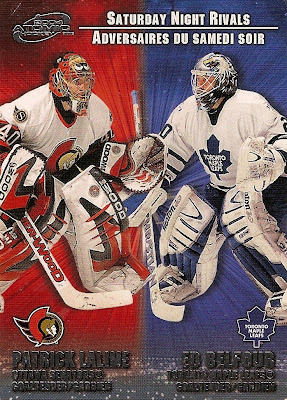
The Lalime/Belfour "Saturday Night Rivals" card is in rough shape but is my favourite insert set for sure! Such a sweet design, sweet name and just sweet overall! Once again, I have one out of the six cards in this set.

The last insert set called "Net Fusions" is a pretty cool all goalie set. It has a mesh background that looks like a net behind the goalie. This time I don't have any of the six cards in the insert set.

In total here is what I have to chase:

BASE: 2, 4, 5, 7, 8, 10-18, 20-25, 27-29, 31, 33-38, 40-43, 47-51, 54, 55 
(COMPLETED 25.5%)
"Hockey Roots" CL: 1, 3-5, 9, 10 
(COMPLETED 40%)
"Canadian Pride" INSERT: 1, 2, 4-6 
(COMPLETED 16.7%)
"Etched in Time" INSERT: 1, 3-6 
(COMPLETED 16.7%)
"Net Fusions" INSERT: 1-6 
(COMPLETED 0%)
"Saturday Night Rivals" INSERT: 1-4, 6 
(COMPLETED 16.7%)

TOTAL: 18/85 CARDS (21%)

To wrap it up, I ask, if you have any of these laying around to contact me at johnny_canuck57(at)yahoo.com or drop me a comment below. I'd be more than happy to work out a trade for these bad boys. 

Thanks in advance!

GO NUCKS GO!
Saturday, January 26, 2013

PACK RIP - Hat Trick of Certified

A trip to my LCS shop this afternoon scored me three fresh packs of Certified. It seems like as long as I  buy two packs, I'm guaranteed something good. After these three packs, I still can't complain.

I'll spare you all the base cards and just show the bulk of them in one scan:


My first Canucks base card from all these packs (I think) is of Henrik Sedin.

The regular GU jersey cards are nothing to write home about, but not bad as a set. It all depends on player selection. Boy oh boy, did I get a good player...


Nick Lidstrom is a living legend and I'm sad to see him go. He was such a work horse for the Wings throughout his years and truly a household name. To me, pulling a Lidstrom hit is just as valuable as pulling a guy like Crosby. All class card.


Such a great insert idea and execution, and this card is the perfect example. The insert isn't called "Play-Off Rivals" it's called "Path to the Cup," which is a very smart move by Panini. Realistically, to get a good number of cards in a set that involves the play-offs, not all teams can be "rivals". Example A: Chicago and Phoenix; so by called the set "Path to the Cup" it eliminates the cheesiness factor and ups the ante. I particularly like the look of the back of the card with the scoreboard idea. Only thing I would change is the back pictures. Instead of re-using the same picture on the front, do a neat design with the two team logos; spice it up a bit.


Last but certainly not least is this SICK insert! It quite literally matches the name "Goalie Pulls" as the picture of Jimmy Howard is actually an acetate pull-out. Such a neat concept and really well executed! I think I might know a guy interested in it too...

Anyways, hope everyone is enjoying their weekend and let me know what you think of the product and your experiences with ripping some packs!

GO NUCKS GO!

Tuesday, January 22, 2013

INSERT IDEAS - 2012-13 Certified "Masked Marvels"

I was sifting through some cards today when I came across an insert that might have some mixed reactions; in fact, I can guarantee it has received mixed reactions. So the best way to figure out if it's a good insert or not would be to put it through the test of "Insert Ideas."

The card in question is the 2012-13 Certified "Masked Marvels" set. Here is the only card I have from the set but I've seen the bulk of them online already...

NAME: Masked Marvels
YEAR: 2012-13


First let's discuss the concept or "idea." Pick any synonym of the word over-used and you hit the nail on the head. It seems that most products these days have a goalie mask variation of an insert set. That's why it will be hard for this insert set to get a good mark. They really have to "WOW" me if they're going to use a generally popular idea. Products like "Between the Pipes" from ITG have done that right. They were one of the first to put out the concept (if not the first) and now they have a loyal fan base that look forward to the cards each and every year.

Next to determine the quality of the insert would be the design factor. What makes a good mask card? Masks! I have no problem with the size of the picture they chose for the front. Not only does it show off most of the mask (which I'll get to later) but it also shows how the mask meshes in well with the jersey. Additionally, the foil background and black and white banner/logo gets an A+ from me. By using this much foil and non distracting colours, it doesn't take away from the art on the mask or the colours on the picture. Therefore, the picture is really what determines the colour of the card. Its like making a team coloured theme card but not adding any extra colours; brilliant!

But the back is where things get nasty!


Instead of following along with the sleek and smooth design of the front, the back of the card goes all Pinnacle on me (much like the base cards). The same picture is re-used on the back AND the paragraph on the player mentions NOTHING on his mask. Thumbs wayyyy down. In my opinion, you scratch the team colours, you scratch the stats and you start the bottom in an all grey fading into a head on shot of the mask (not the same as on the front) in the top half of the card. That way you get a different angle of the mask, you continue with the non distracting colours and you let the picture and colours of the mask do all the work. Underneath that picture in the grey area, you can do a small write-up on one part of the mask in white ink. All logos (NHL, Panini and NHLPA) can go on the bottom and the card number and team logo can go on the top left and right corners. What you DO NOT need is the position, I think it's pretty obvious he plays goalie guys...

As for the picture, like I said, I like the idea of using a shot from the chest up; but, you need to see at least 2/3 of the mask (i.e. the Lehtonen card above). Other cards in the set (i.e. Jimmy Howard) show just half the mask and that does not cut it. As well, as I already mentioned a head on shot of the mask on the back of the card would be a great touch instead of the debacle we see on the back of the card currently.

Last but not least is the player selection. There are 20 cards and therefore 20 goalies in the set. I would like to see one goalie from each team just for variety's sake, but I'll only dock them minimal points for that.

RATING:

IDEA - 2/5 (Overused and getting old)
DESIGN - 2.5/5 (Front of the card gets a near perfect 2/2.5 but the back gets only 0.5 points)
PICTURE - 3/5 (Like the pics from the chest up but need to show more angles of mask)
PLAYER SELECTION - 4.5/5 (I can't be too picky)

TOTAL - 12/20

Passing grade I think is acceptable but nothing to chase IMO.

What do you think? What do you rate the card out of 20?

GO NUCKS GO!

Monday, January 14, 2013

CANUCKS STUFF - Season Tickets

The eight year old boy inside of me gets a little excited when my pops comes home and says, "I have some hockey stuff for ya." What was it he had? Take a look for yourself:

That is 13 different season ticket holder books from 6 different seasons.

Now the boy inside of me said, "This is gonna be so cool, you can add these into your ticket collection and one day they're gonna be worth millions!"

The 17 year old teenager said, "What are you gonna do with a bunch of unredeemed play-off tickets from non-existent games?"

The eight year old boy won. Of course I kept the books, they're freakin cool!

Basically these books are from past years where the Canucks made the play-offs (or the organization thought they were gonna make the play-offs).

Before the play-offs start, all the season ticket holders get their ticket books for the upcoming rounds.

Sometimes you'd have an entire booklet of unused tickets because the Canucks came 9th place and didn't make it. 

There are even tickets for rounds that lasted only 4, 5 or 6 games so the other tickets are for games that never happened.

Even though all my tickets prior to this were from games I had attended and I was proud of that fact; this is pretty rad as well

Now for some show and tell:


That flat booklet to the left is from the 2007-08 season for round 1. Unfortunately, the Canucks did not qualify for the play-offs that year. That's why that booklet is untouched and actually should never had existed. Kinda cool huh?

The booklet to the right is actually from last season. It's also neat seeing how the tickets have changed over the years and the different themes.


The tickets to the left look similar to those of last season but are actually from the 2011 play-offs. Then to the right we have a completely different design, with the theme of retired Canucks (Stan Smyl, Kirk McLean, Trevor Linden and Greg Adams).


From 2008-09 are these set of tickets, again going with the Canucks Alumni theme. From left to right is Adams, Snepsts, Linden (I think) and Smyl.

I thought this was kinda a neat find; very unique to be exact. Who knows maybe these will get passed down from generation to generation and they'll be worth more than a bucket of nickels. That may just be the eight year old boy talking...

GO NUCKS GO!

Wednesday, January 9, 2013

OOPSIES! Contest #3 - Answer

The fact I said that this error was an easy one, I believe tripped some of you up. The answer smacked you right in the face, but I believe some of you dug a little too deep, which isn't a bad thing. Some even started finding errors that made me question if there was more than one mistake on the card.

At last, there is only one true blunder on this card, take a look one last time and see if you can narrow it down:


ANSWER: In the bottom right hand corner is a Maple Leafs logo. Dan Cloutier never played for the Maple Leafs...ever...

In fact it looks like there is a Canucks logo actually underneath the Laughs logo. Looks like they got it right the first time. Because of the uniqueness of the error, I took a look at my double and it had the same mistake.

Nonetheless, 11 out of 16 of you got it correct. Unfortunately, 1967'er only gets partial points because he took two guesses kinda. 

There were 4 of you that went bananas and made me do some research. The comment on the back of the cards mention Cloutier getting "double digit wins" when he only had 7 wins in the 2000-01 season. Those "double digits" refer to the 2001-02 season. With that * before the save percentage stat, I couldn't find anything online or on the back of the card. Unfortunately, that will not count for points...

With that being said here is where all the contestants stand!

1.     NordH - 6 points
2.     Jess - 5 points
        JGBlargh - 5 points
4.     Kevin Osimitz - 4.5 points
5.     Brad Larocque - 4 points
        1976ers - 4 points
        BTHCC Kyle - 4 points
        Sean - 4 points
        Hockey Fan (Paul) - 4 points
10.   Cap'n Canuck - 3.5 points
        Sébastian Hell - 3.5 points
        Kazi - 3.5 points
13.   Skroeker - 3 points
        Jason - 3 points
15.   Dave H - 2.5 points
16.   JS - 2 points
        Paul - 2
        Baseballislife - 2 points
        Sal - 2
        Jayzin Smith - 2 points
21.   Matt Pederson - 0.5 points 

The next one will be harder I promise!

GO NUCKS GO!

Tuesday, January 8, 2013

OOPSIES! Contest #3 - Dan Cloutier Error

Round 3 of the "OOPSIES" contest will boot off what should be a big (not spread apart) series of posts. Why not start off with some Cloutier love?

Just like Dan wasn't the most spotless goalie in the world, his cards got messy sometimes as well. That being said, this error should be pretty easy to spot. Another stat pumper, if you will...


So that is the card on tap. Happy guesses!

As per usual here is how the scoreboard works:

1) Find error and comment correctly (2 points)
2) Be the first person to find the error and comment correctly (3 points)
3) Find the error partially, but not in it's entirety (1 point)
4) READ, but can't find the error although looking. Comments saying "I dunno" or something along those lines (0.5 points)

And if you are wondering where you are in the standings, look no further:

1. Brad Larocque - 4 points
2. 1976ers - 3 points
    NordH - 3 points
    Jess - 3 points
    Cap'n Canuck - 3 points
    JGBlargh - 3 points
    Sébastian Hell - 3 points
    Kazi - 3 points
    Jason - 3 points
10. Dave H - 2.5 points
      Kevin Osimitz - 2.5 points
      Skroeker - 2.5 points
13. JS - 2 points
      BTHCC Kyle - 2 points
      Sean - 2 points
      Hockey Fan (Paul) - 2 points
17. Matt Pederson - 0.5 points 

GO NUCKS GO!